Busy, in-demand restaurants need to quickly understand opportunities and options to organise themselves during shifts as well as plan for the near and far future: seat walkings or queue places “now” as much as check on their future availability. Their objectives are: maximise their capacity, avoid clashes and overbooking.
My role
- Define and understand the problem
- Competitive analysis
- User interviews
- Define MVP and iterations
- UX/UI Design
- User testing
Context
The Dojo Booking and Queue experience touches both the hospitality businesses (customers) and their guests (consumers).
Restaurant Management System (RMS)
is the system that restaurants use during a shifts to manage bookings and queue places and seat walk-ins. When consumers book via Dojo app or restaurant website, the booking information will come through to the RMS. The system is also used to manage the restaurant details and settings (schedules, policies, experiences, opening times, queue and booking availability, etc).
The Dojo app
Consumers can use the app to check for local restaurants with availability to eat now, to join a virtual queue and book restaurants in advance. On the app users are able to check and manage their booking, chat to the restaurants and receive notifications about queue times.
Continuos discovery
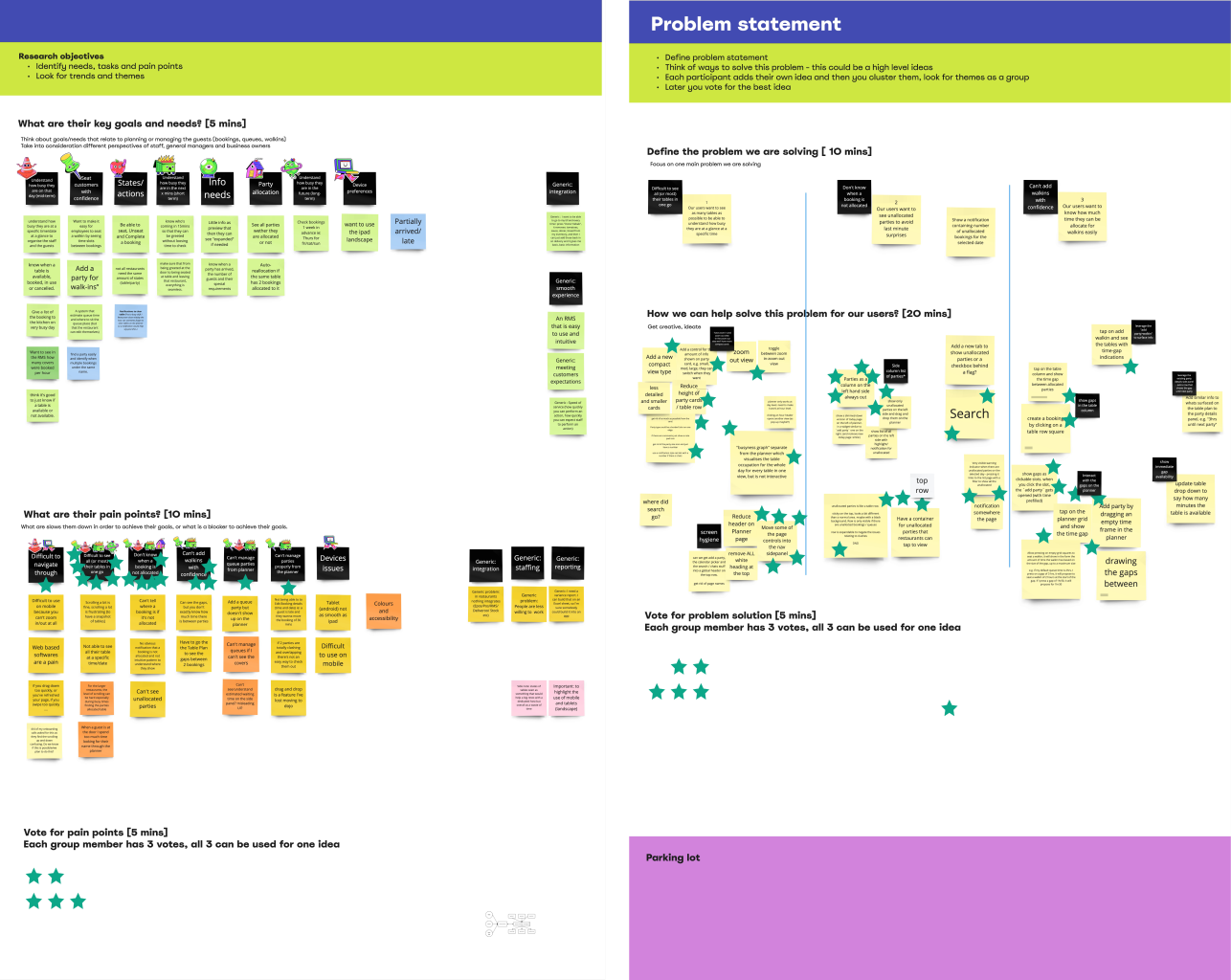
As part of our ongoing discovery and customer interaction, the insight team conducted a research about “What do busy restaurants value in an RMS system?” by interviewing 8 restaurateurs.
Right after this high level research, different members of our squad arranged calls or visits to both our customers and prospects to dig a bit deeper.
One of the main themes that kept coming up across all interviews was the organisation/plan of present and future parties. And one of the main feature interviewees were referring to was a “timeline” or “grid view”.
Insights team research
They summarised that the perfect RMS will tick all these boxes:
- Future proof by help planning ahead (ie staff rota)
- An assisted on the go (ie eating guests)
- Be customisable (ie adaptable table configuration)
- Get closer to customers (ie collect data)
Squad user interviews
What we found out was that in a busy service restaurant hosts need to fulfil a number of tasks when thinking about seating guests.
They struggle with:
- Where parties are going to seat during the day
- Handle guests requests to change table once they are arrived
- Communicate with the kitchen the busy times
- Find the right table for the right party size
- Have the ability override things
- See the knockoff effects of changing allocations
”I check my bookings in the morning so I can plan my day for staff breaks and when they are due to start
”I check this [grid view] every day to see what the day ahead looks like, any special notes. I also look ahead weekly or over 2 weeks to inform staff rota.
”The reason for using the gird view is so I don't mess up the timing of the tables. we always make sure we are only making changes directly on the grid.
”Finding a gap for walkins is a challenge. I switch from birdseye view to timeline view to spot the gaps
The problem
On our RMS, all the upcoming reservations throughout the day were shown as a long list and it was impossible for restaurants to see all parties in one go, where they would be sat and for how long. It was also very frustrating to not have a visual representation of what their status was, in relation to time.
This prohibited restaurant hosts from reshuffling table allocation as required or make seating decisions for walk-ins by seeing when there were availability gaps in between bookings; it also proved to be unhelpful for restaurant managers to make staffing decisions.
Hypothesis
If we build a grid view that will allow our customers to plan ahead for their day(s), organise their restaurant and staff to provide customers with the best experience, whilst maximising the number of guests they can seat on a daily basis.
Key metrics
Table utilisation
Increase the average table utilisation per location per day (%)
Walkings number
Proportion of walkins on the total arrived parties per location (%)
Time spent on the page
Average time spent (secs) on each RMS page per day
Competitive analysis
Many of our competitors are offering a “grid” view, providing a lot of value to some their customers (some other prefer the “birdseye” view).
By conducting a competitive analysis I was able to assess the features built by our competitors, understand their pros and cons, as well as the customer interactions with the page and potential frustrations.
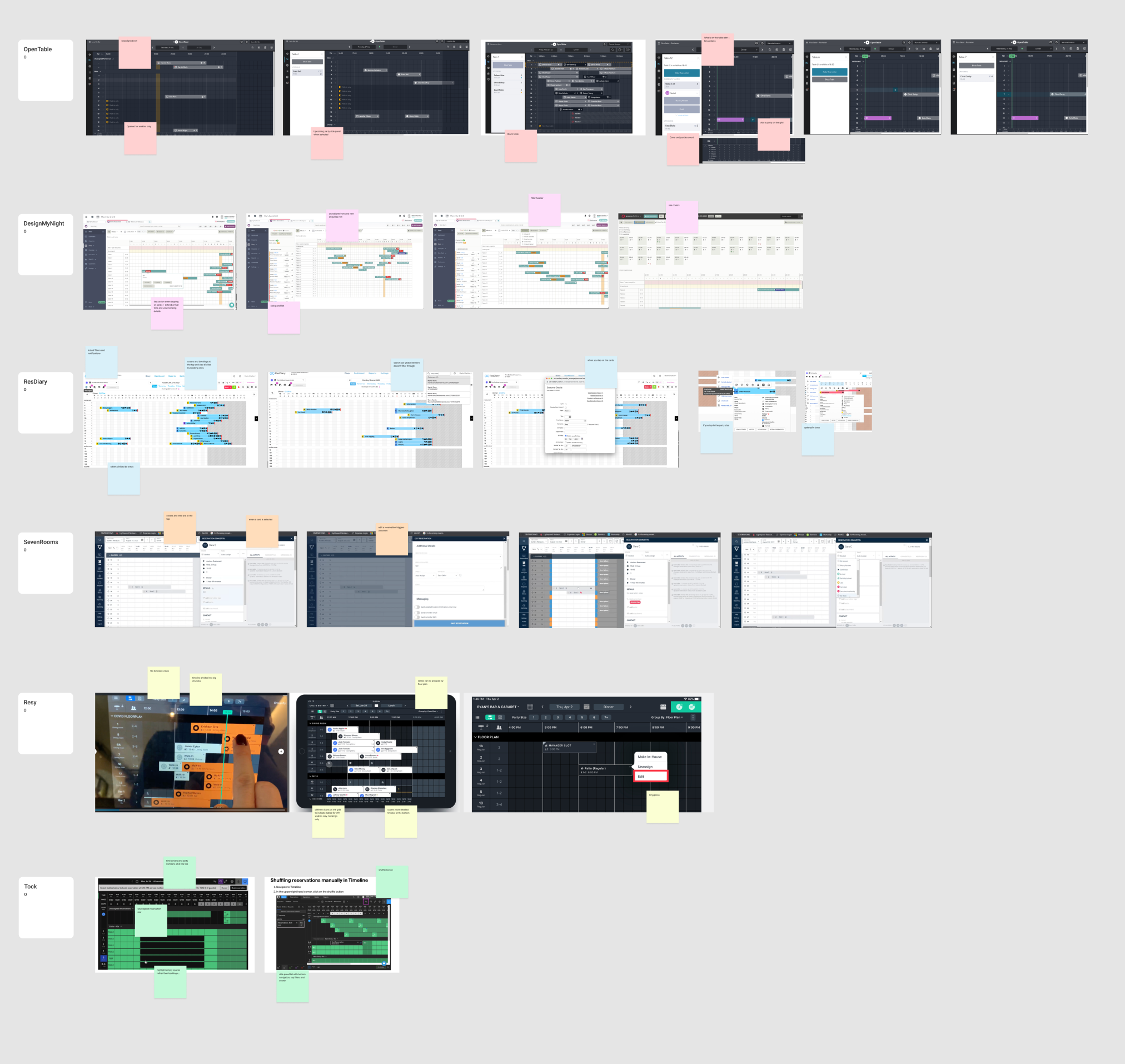
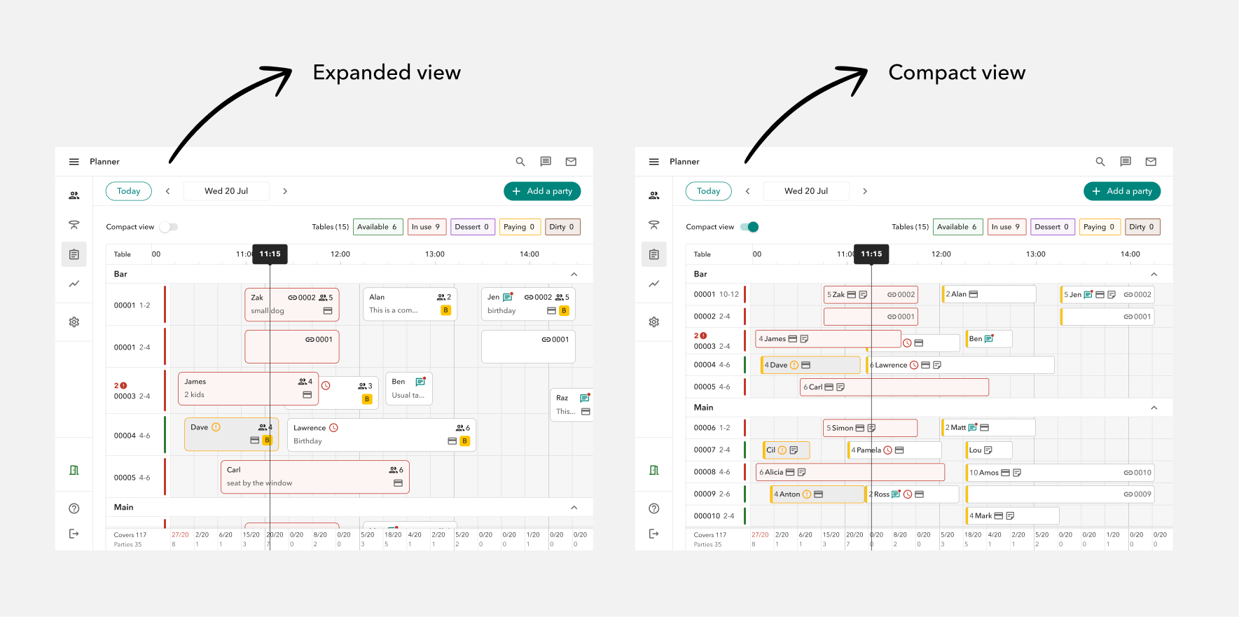
Some products have a lot of information on the “grid” page which results in a high cognitive load; some have chunky party cards, some have very slim ones; some allows to reshuffle the parties to different tables with a click.
However, the common elements to all of them are: a background grid divided in slots, a top time bar, a side table column with table name and party size, a time indicator that highlights the current time, a cover count, party cards representing current, past and upcoming parties, a calendar to navigate to past and future dates.
P0 - High level approach
Considering the problem, and after assessing what our restaurants are mostly asking for in research, while also studying what other RMS competitors are doing, we started off with a MVP which consisted in a daily “grid” view (24 hours) to show all assigned, seated and completed booking parties across the restaurant tables and areas.
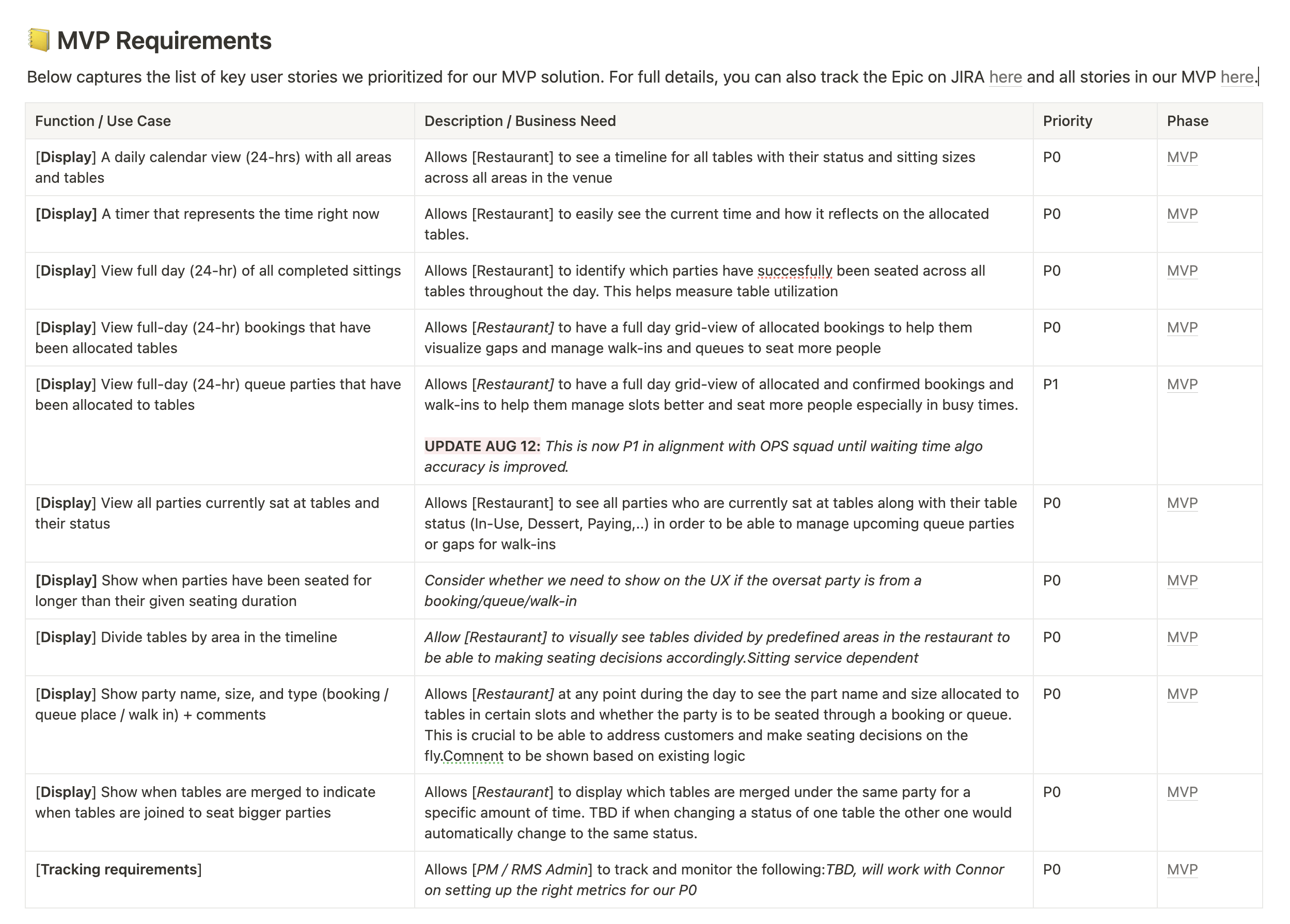
Queues parties were left out of the MVP due to a performance issue with the queue time algorithm.
Edge cases
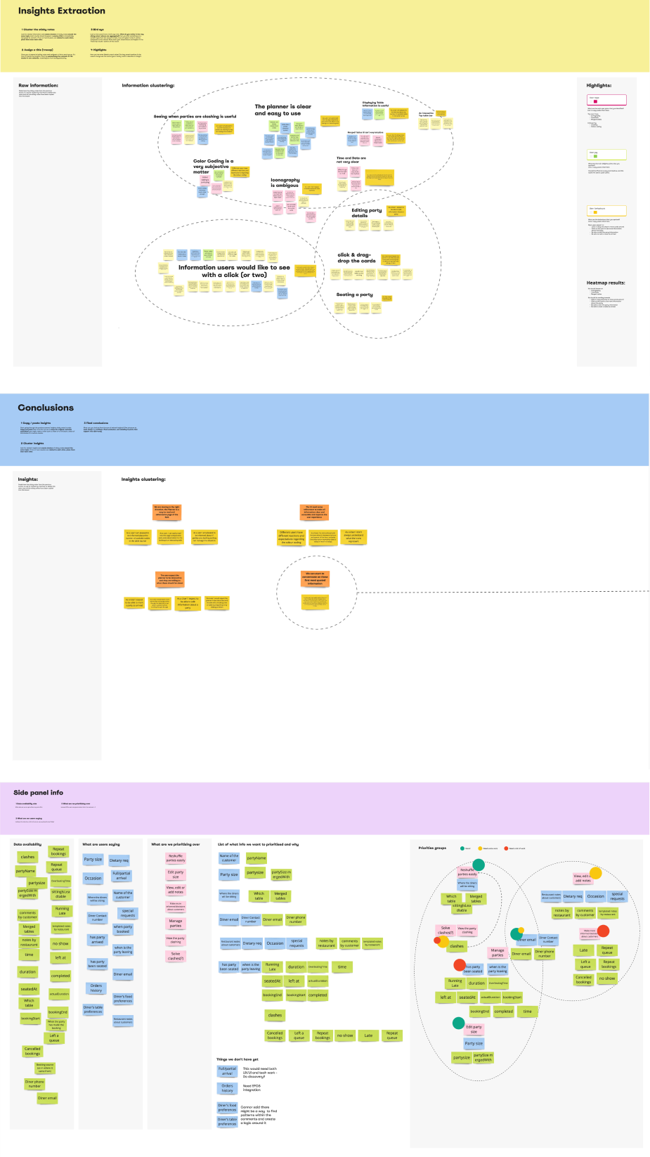
As a fresh new squad made of all new joiners, this project really helped us to immediately create a strong sense of collaboration between design and engineers. I worked closely with 2 FE to document the edge cases that could arise from visualise bookings, queues and walking on a the “grid” view. We documented each case on Notion and linked it to the designs on Figma.
Cards design
The design for the cards has been done in parallel to the edge cases uncovering. This represented the foundation of what we wanted to build: in order to get it right and to give the developers all the information to proceed with their job smoothly I decided to be particularly meticulous.
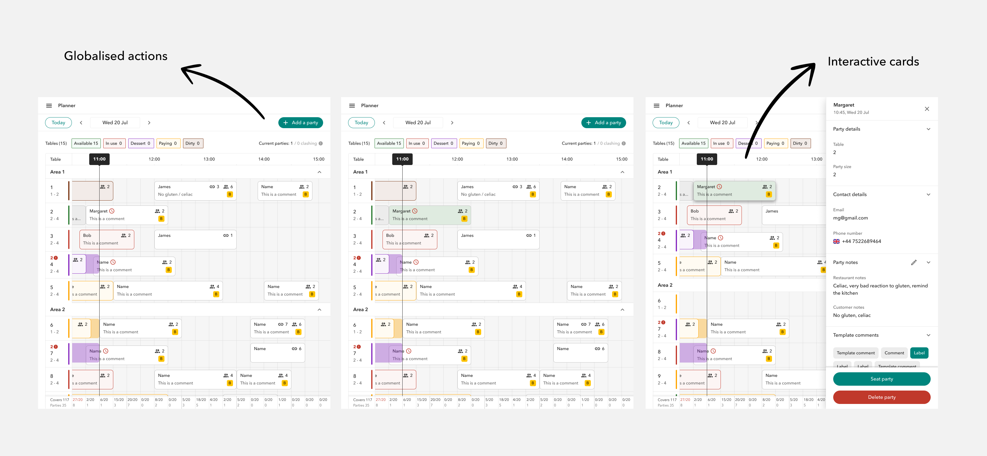
Each card features the name of the guest, party size, templated and written comments and merged tables (if any). The card has different colours depending on the table state. If the party overseat, a semi transparent bar will originate from the right side of the card itself until the party is completed.
I also had to account for clashes which happen when two parties are assigned to the same table and they might fully or partially overlap in time.
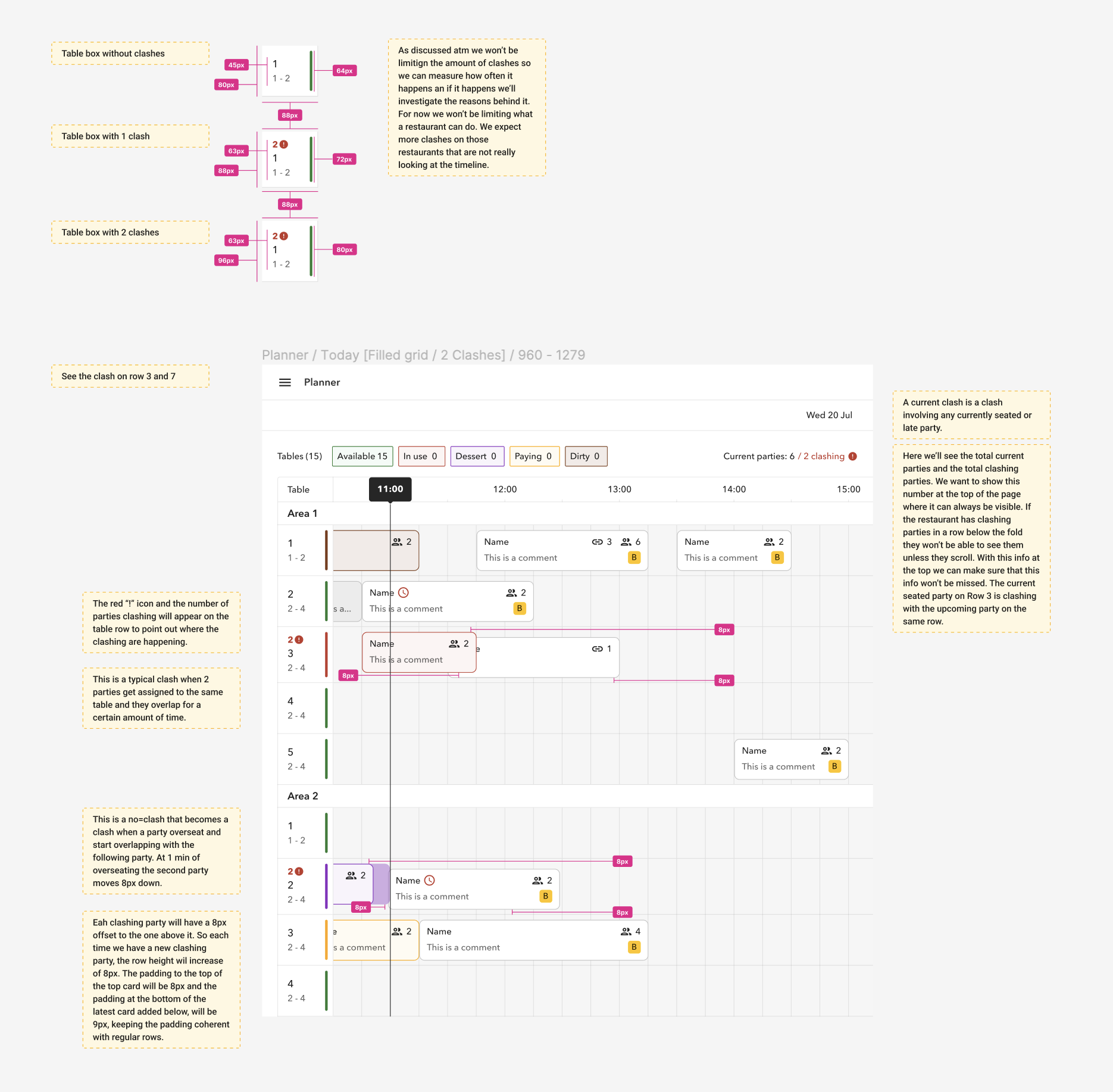
Also as said above, we had table states that had been around for a while (available, in use, dessert, dirty and paying). We still thought it would have been useful to show these states on the party cards to convey important information to our users right were they needed it. The table states did not account for some states which would have been unique to parties like “upcoming” or “completed”. I worked to add them to the existing experience and more work has been done and still is in plan to improve them.
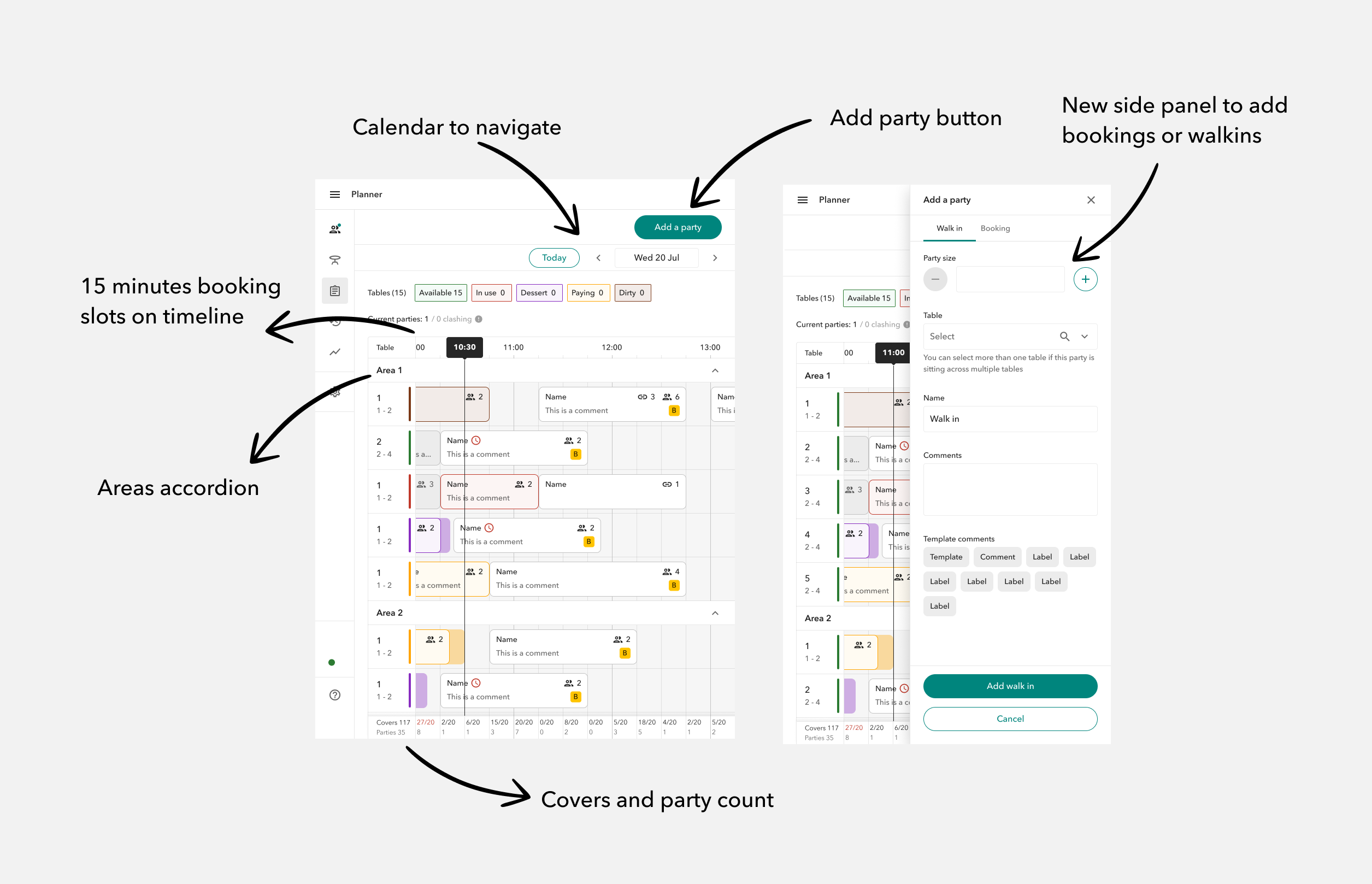
P0 design
The P0 consist of a 24h view (read only) of only allocated bookings, based on the restaurant opening times and schedules. The tables are divided by areas (as per restaurant set up), and the tables within each areas are listed in alphabetical order. Each table is detailed through the assigned name, party side range and state. This view also let the restaurant know of clashes so that they can take care of them, as well as the current number of parties, and the current table states.
User testing
Through usertesting.com, I started to test the P0 designs with both our customers and restaurants using other RMS (for a total of 7), to gather feedback on the information displayed and to evaluate what quick iteration could fast follow by checking on their behaviours.
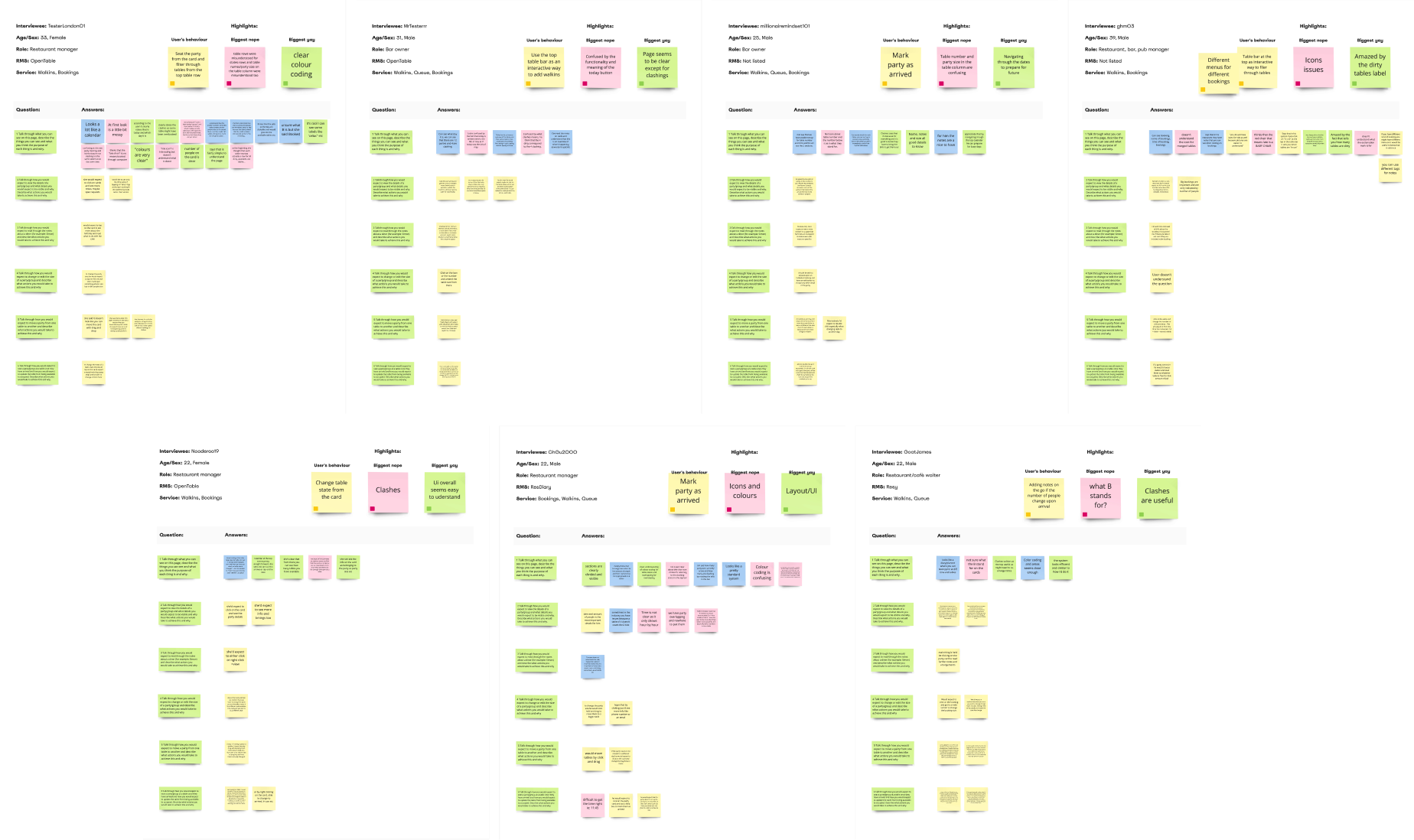
Results
Overall the P0 has been described easy and intuitive, and the table info seems quite useful.
Most users expected to:
- Click or drag and drop to move cards around
- Click on the card to see more information about the party*
- Be able to edit the party information
- Be able to mark a table as arrived
- See a lot more details and be able to perform lots of action from either side panels** or modals
*the side panel was under re-design by the other squad working on the RMS
**gave us ideas on how to quickly iterate in what the other squad was building
Roll out
We extracted a list of key targeted restaurants who use our RMS today to manage bookings.
Our aim was to start gradually rolling out to 25% of those who would benefit from planner first i.e use us for bookings mostly, followed by 25% of restaurants who operate with bookings/queues and then complete the rollout (100%) for all remaining restaurants who either do queues only or have very few bookings a day.
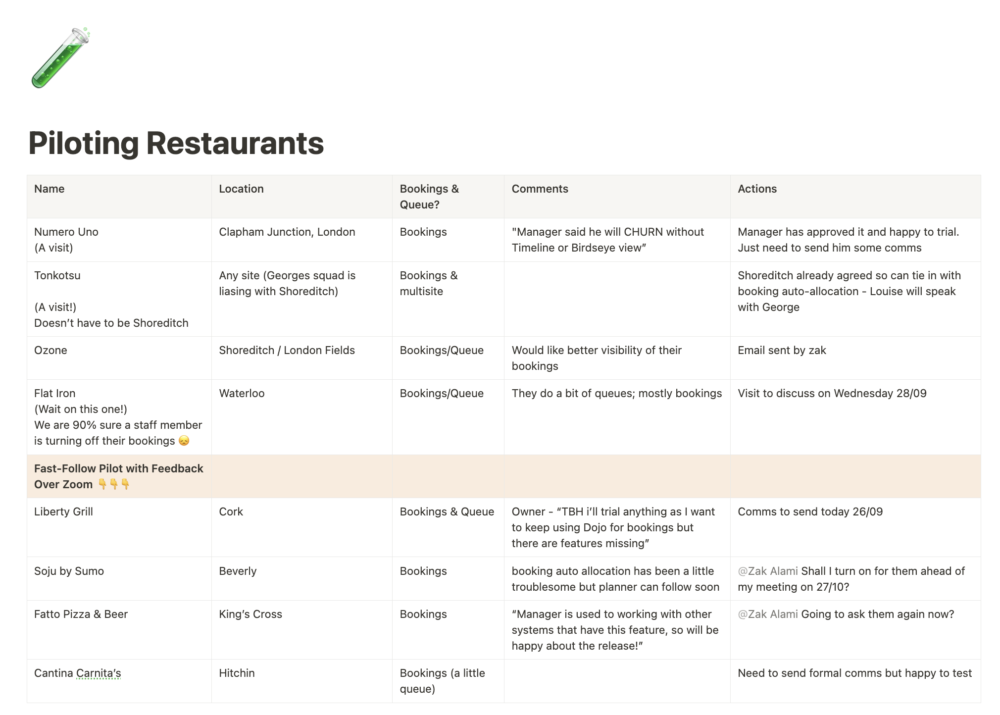
For the first gradual rollout, we choosed between two buckets of top performing locations and all participating restaurants use RMS on multiple devices (>2 devices).
Learnings
The P0 1.0 made up to only 1% of RMS traffic following its launch. What went wrong?
No auto-allocation
Only 20% of customers who use our RMS to manage their bookings have auto allocation set up
No interactions
Users had to allocate bookings from another page, which isn’t intuitive
Nice to have
Without giving the staff the ability to manage booking parties the page has little value
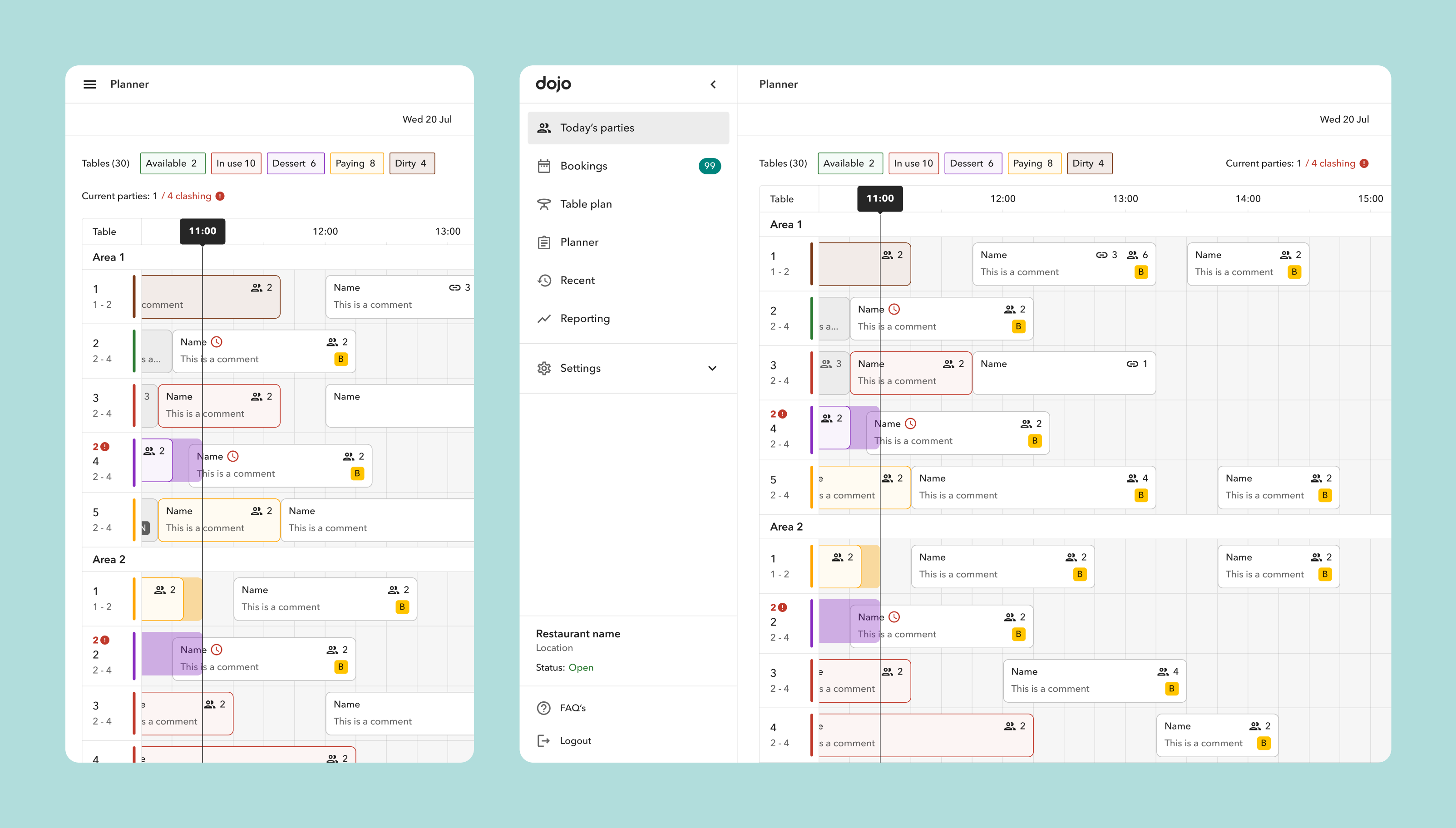
Iterations P1.5 & P2.0
P1.5
P2.0
Feedback
We carried out interviews with our current customers (5 in total) to collect more feedback and we also took into account the feedback coming from our Ops team that is daily in touch with restaurants and pubs.
Learnings
With Planner 2.0 rollout mid of Jan 23’ and with plans to drive higher uptake in auto allocation across all existing and new customers, we are expecting higher use and overall value for the Planner as restaurants would be able to seat, shuffle and complete booking parties, but still face the following key problems:
Unallocated parties
Auto-allocation was active for around ±20% ,but even with a 100% roll out there could always be edge cases
Seat walking fast
Customers want to look at the screen for as little as possible while they interact with consumers
More is more
Customers want to see as many tables as possible to be able to understand how busy they are at a glance at a specific time
Iteration P3
We delivered few iterations based on the feedback received.
P3.1 Compact view
P3.2 Unallocated parties + drag&drop
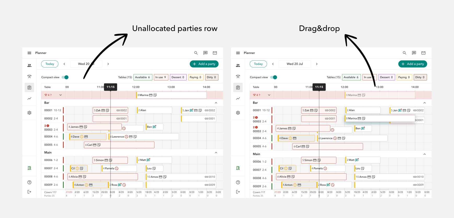
P3.3 Table states
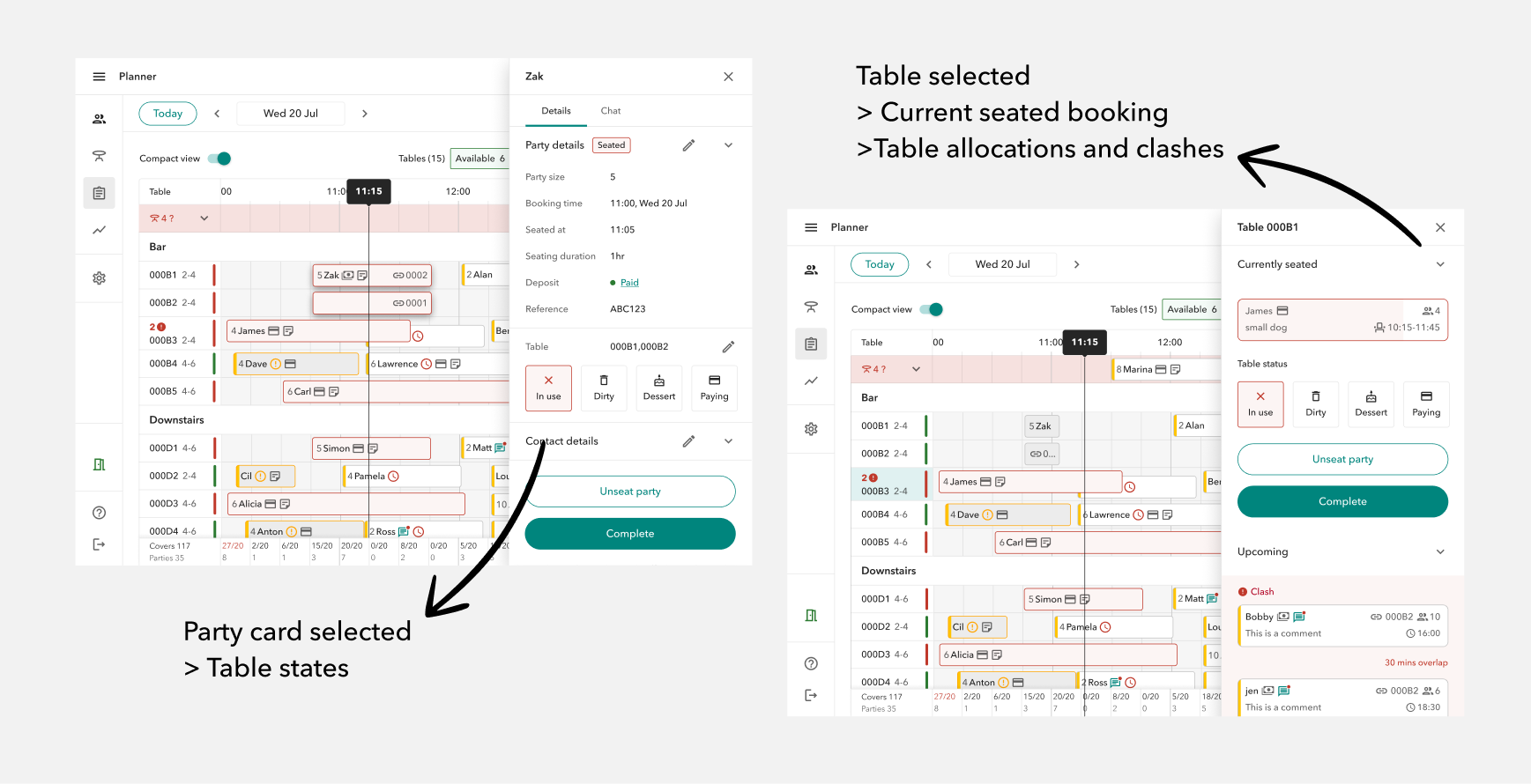
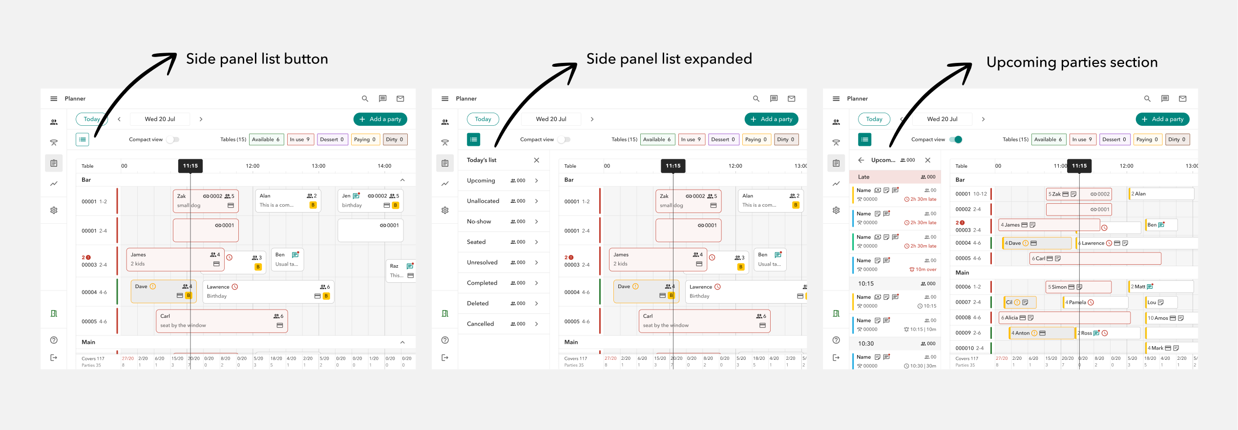
P3.4 Side panel list
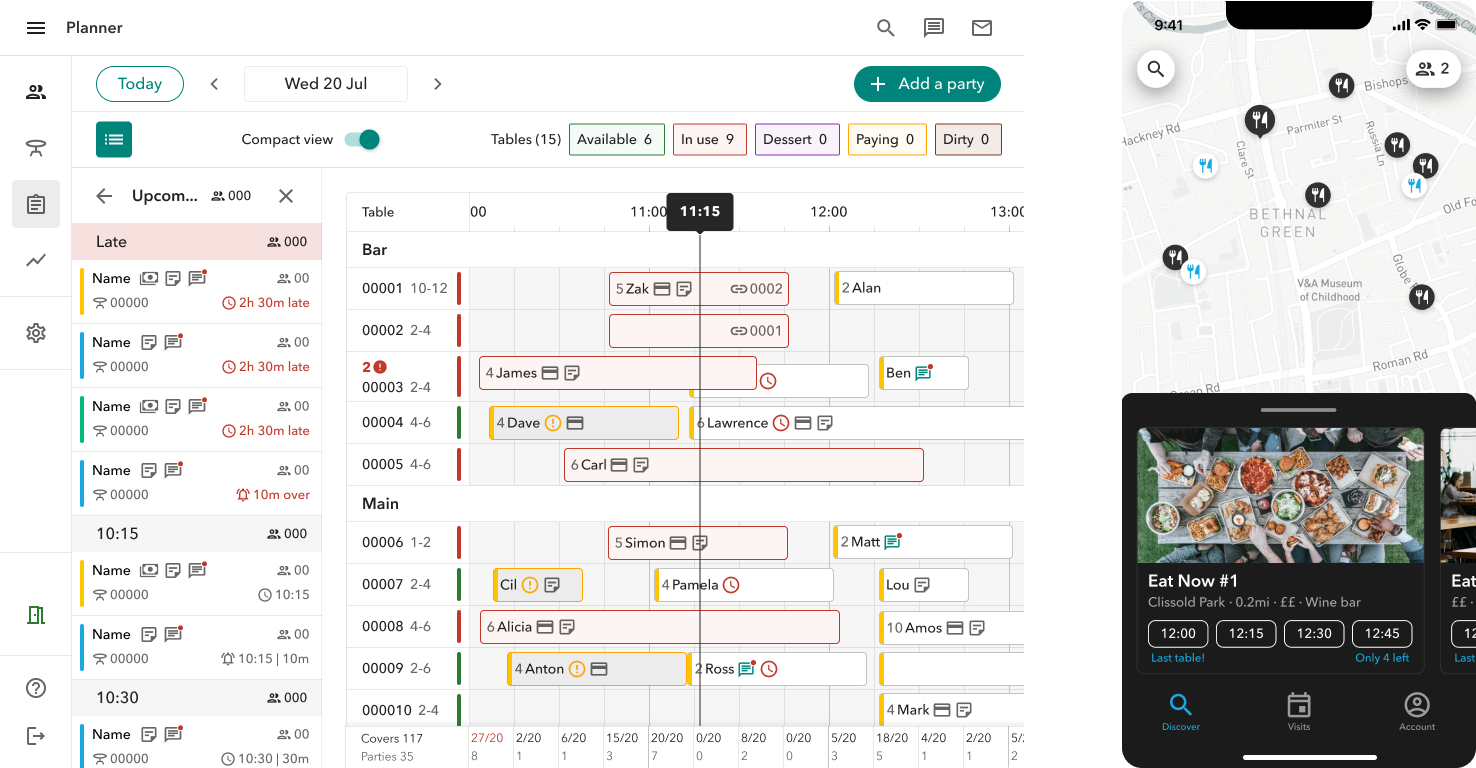
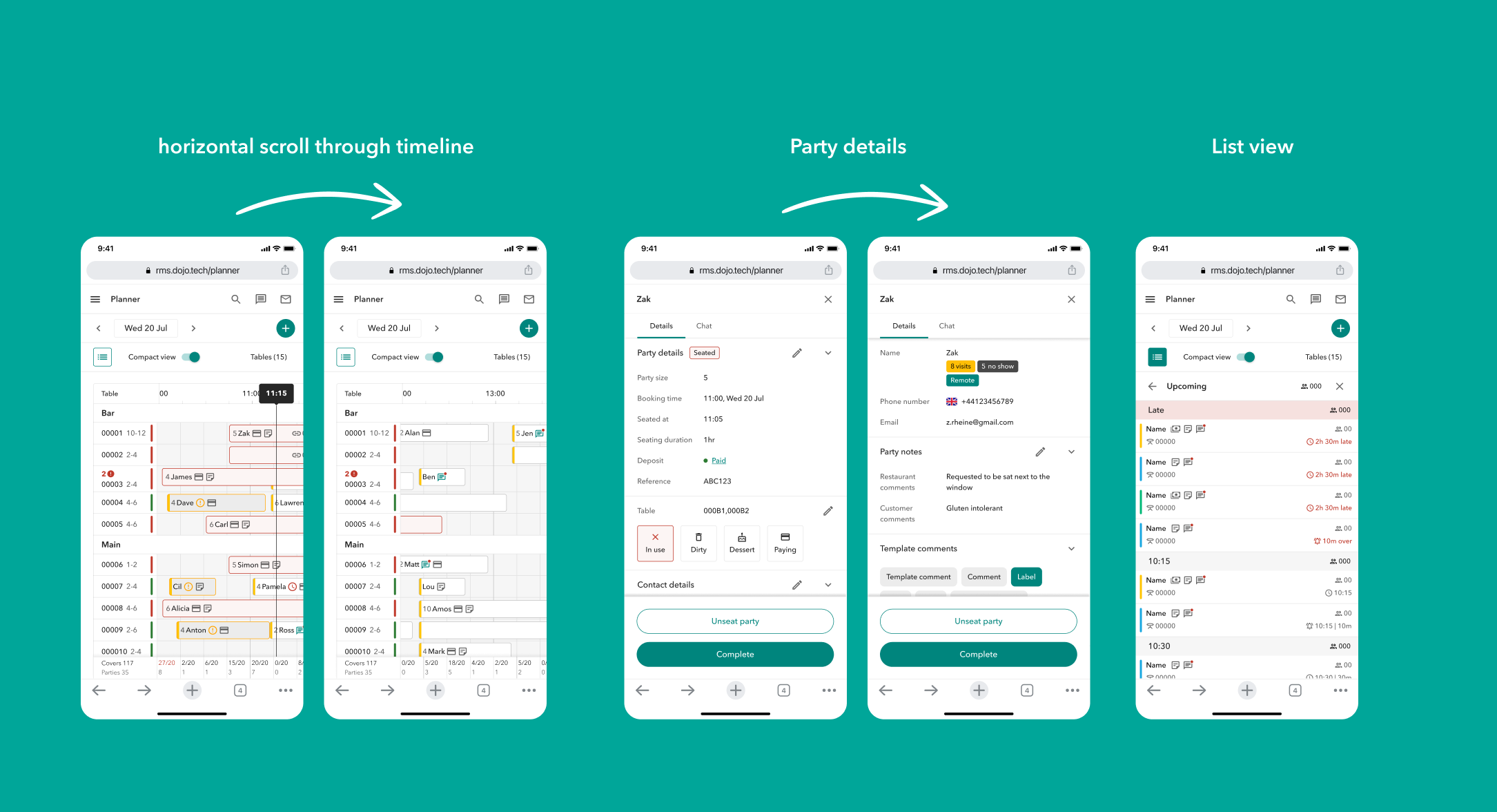
The mobile experience
We’ve recently seen a increase in the usage of the RMS on mobile, and our team aims to give our users the same core functionality they can access from bigger screens.
Depending on the data and use case, mobile screen size might be the one I’d consider to design for in the first place.
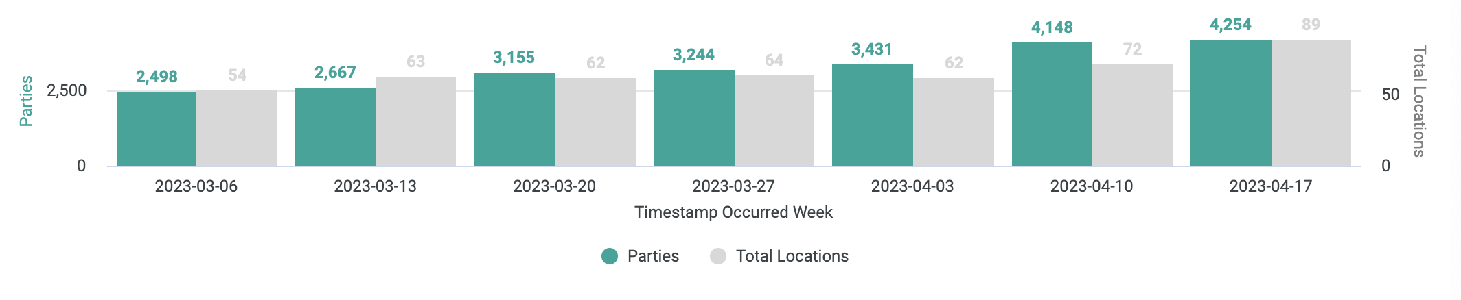
Results
By looking into Planner data from April 2023, we can see (1) seated parties growing consistently WoW and (2) Number of engaged Active Locations going up ; April wasn’t our month’s highest number of Sales but a good bunch of these 89 Active locations were from newly onboarded customers!