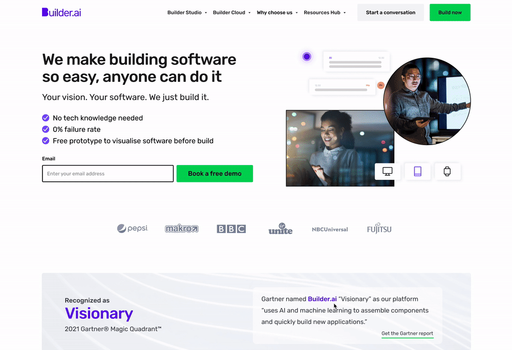
Builder.ai mission is to use the power of software to unlock every human’s potential regardless of their background, tech knowledge or budget. Builder.ai goal is to make software so easy, everyone can do it.
My Role
- Digital designer for Growth/CRO
- UI/UX for the website
- Brand campaign creatives
- Managing other designers
Homepage Redesign
Business Problem
Our visit to demo done rate is very low. The content on our pages are not doing a good job at educating users on out offering
User Problem
Users are not well enough informed about our offering. User testing and onpage poll research shows that the reason stopping users getting a demo is that they do not know enough about our product
If we
Update the homepage to include more relevant information for our personas, based on the value proposition research carried out at the beginning of the quarter
A win would be
Visit to demo booked CR increase
Then
Lead quality should improve as users are better educated about our product
Before
After

What changed

Results
Lead, MQL and demos booked were all significantly improved as a result of the test. The changes made resulted in 4x increase in demos booked from homepage directly, and almost doubled demos on form page.
We also saw an increase in users accessing the pricing page, which we know drives higher quality leads (27% more were accessing the pricing page).
Next steps
Use the new template on other landing pages including “persona pages”
We can make use of the new components built across other key pages in order to improve site conversion rates
Test: add the “Why Builder.ai” page to the top navigation
Feedback has shown that customers don’t know who we are, and what our product is, or how we are different to competitors. We want to inform users about who we are and how we are better than competitors as well as add value, and trust to the journey
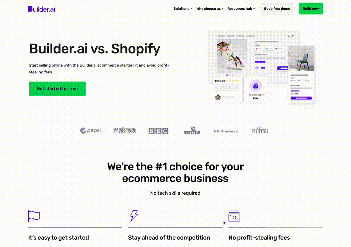
Compare Pages Template
Business Problem
When companies don’t create Comparison Pages at all, more than likely, their competitors have — and are therefore controlling the narrative for prospects about how your products match up. We wanted to put these pages in place and acquire users/customers of direct competitors organically.
User Problem
Users have not enough time and specific knowledge to compare Builder vs Competitors and they risk to lose a lot of money by not owning their app/website by paying unreasonable fees. We aim to show true comparison to provide prospects with what they came to that page to understand.
Solutions
- The page hosts a lot of content due to the nature of the page itself and because of SEO reasons. We wanted to make the content as easily to navigate as possible
- The calculator should be showing the overall result and then dive deep down into details rather than the other way around or we’ll be risking to overload the user with info
- Trust elements are fundamental on this page, especially considering that the prospects might not know you (but they could know your competitors)
Page template and calculator
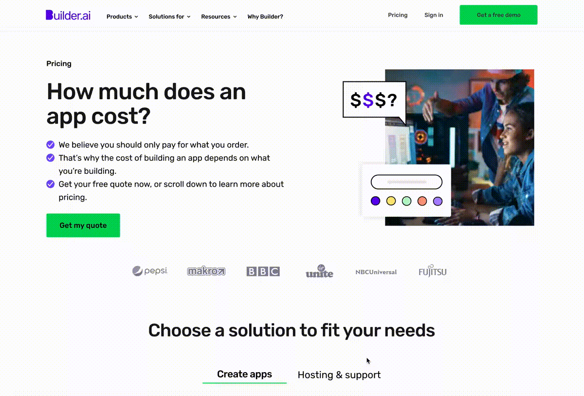
Pricing Page Test
Business & User Problem
A full Pricing Page explaining different products and related costs was missing on our website as well as from our navigation. This was a missed opportunity to drive potential clients to choose the suitable product considering their business need and budget. Users found some difficulties on choosing the right app product, based on the showed USPs at the time. Some of them chose Studio Store and reported the packages are not for their business (while missing the right option – Studio Pro). There is also some confusion around terminologies.
Solutions
- Create a Price page that could make immediate sense to our possible clients not much based on our products name but on their needs and budget
- Show the different options in a simple and comparable way and reinforce USPs
- Add “Pricing” to our nav bar to make the page immediately visible to everyone
Results
- Visit to demo booked increased by 249%
- The pricing page in particular had one of the highest lead to demo booked CRs, showing that giving users more information improves lead quality
- Lead: MQL rate 80% (vs homepage baseline 57%) – 40% higher than baseline comparison
- MQL: Demo rate 25% (vs homepage baseline 5%) – 400% higher than baseline comparison
Page template and calculator
Adding credibility to Studio Store Landing Page (testing)
Business Problem
Our visit to demo rate is very low. The content on our pages don’t seem to be doing a good job at educating users on our VP, product benefits, customer pain points, and our process.
User Problem
Lack of clarity about the product, process and VP leading too low motivation to do a demo.
If we
Based on our research if we enhance the page copy by:
- Updating the VP
- Making secondary CTA enticing by adding clearer sales oriented copy
- Make the calculator a priority on the page and highlight the pain point of customers through copy changes in this section
- Updating explainer paragraph copy about the benefits of the ecomerce app
- Adding “How it works” process
Then
Lead quality should improve as users are better educated.
A win would be
Visit to demo done and CR increase.
Results
- Extra demos per months: 125 for Studio Store
- Yearly revenue contribution: $210,000
- Changing the secondary CTA copy increased clicks by 57%
- Making the calculator a priority got it more clicks. As know by research, interacting with calculator increases the “book a demo” rate.
Control

Variation

Possible new variation
